Capital Group
Designing a consistent multilingual experience for investment funds
Role
UX/UI
Timeline
18 weeks
Scope
Fund marketing websites, responsive UI, component library and developer handover
Overview
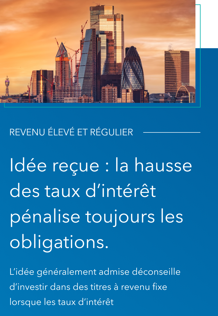
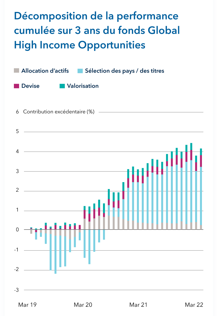
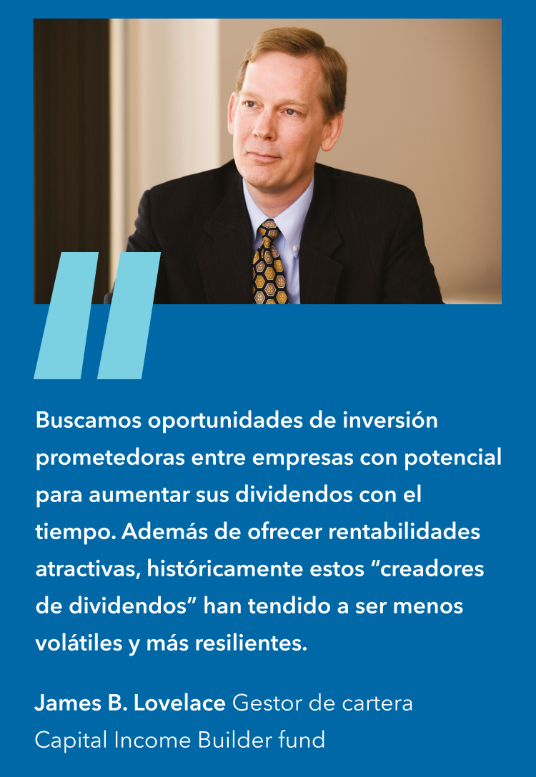
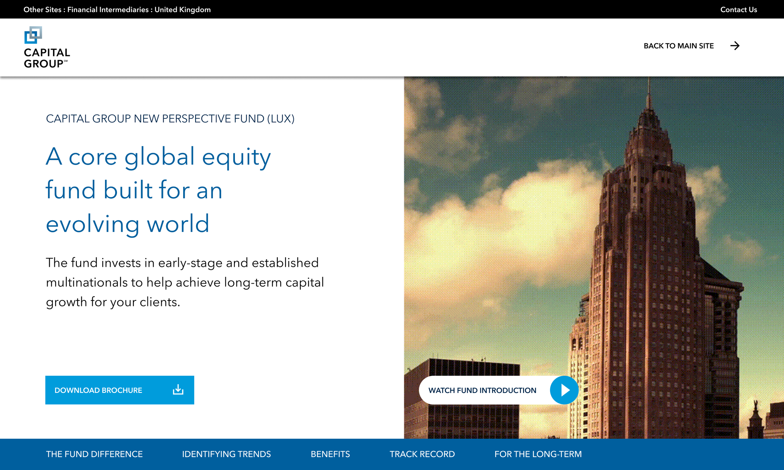
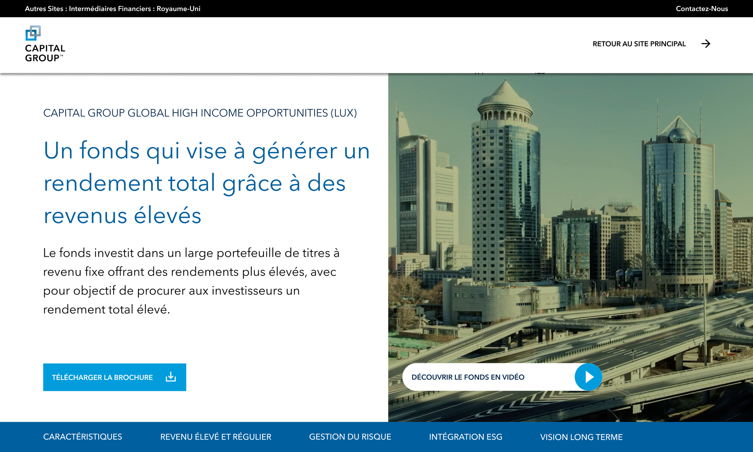
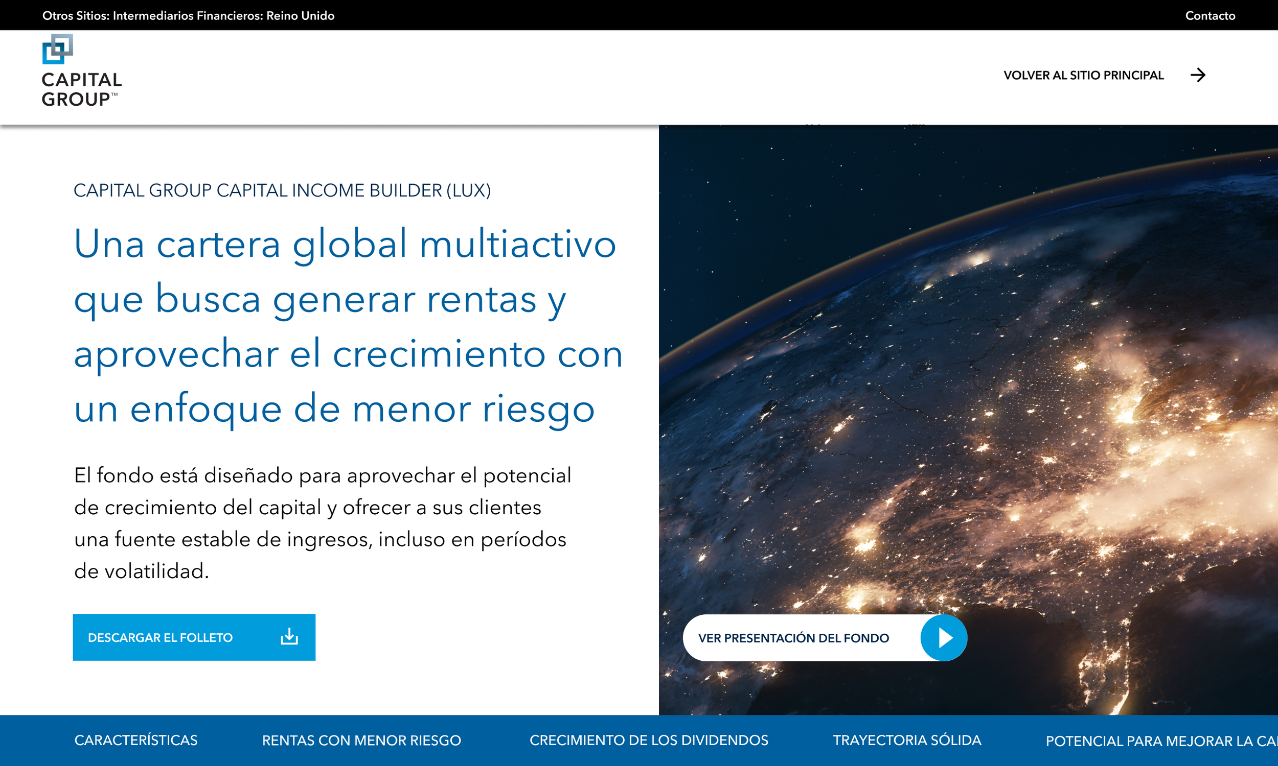
I worked on three investment funds: New Perspective Fund, Capital Income Builder (CIB) and Global High Income Opportunities (GHIO), adapting their digital marketing experiences for French, Spanish, German and Italian audiences.
The challenge was to create a unified experience that could accommodate different fund information, remain visually consistent with Capital Group's brand and printed brochures, and give investors clear access to relevant documentation.
The Challenge
How could we create a consistent experience across multiple investment funds and languages without compromising clarity or flexibility?
Each investment fund presented different information, including performance data, fund characteristics, supporting documentation and promotional content.
The existing experience needed a clearer, more consistent structure, particularly around navigation and access to fund factsheets.
The solution also needed to accommodate multilingual content and ongoing fund information updates without requiring an entirely different design for each fund.

Design Approach
-
I organised the fund pages around three core information areas: key facts, supporting documents and performance information.
This provided a consistent information hierarchy across the funds while allowing their individual investment propositions to remain distinct.
I also prioritised two important user actions: accessing the Fund Centre and downloading fund factsheets.
-
Rather than designing each fund page independently, I developed reusable page patterns and components to establish consistency across the experience.
The approach supported different fund content, imagery and investment information while maintaining a recognisable visual structure.
It also provided a more maintainable foundation for recurring updates to fund information.
-
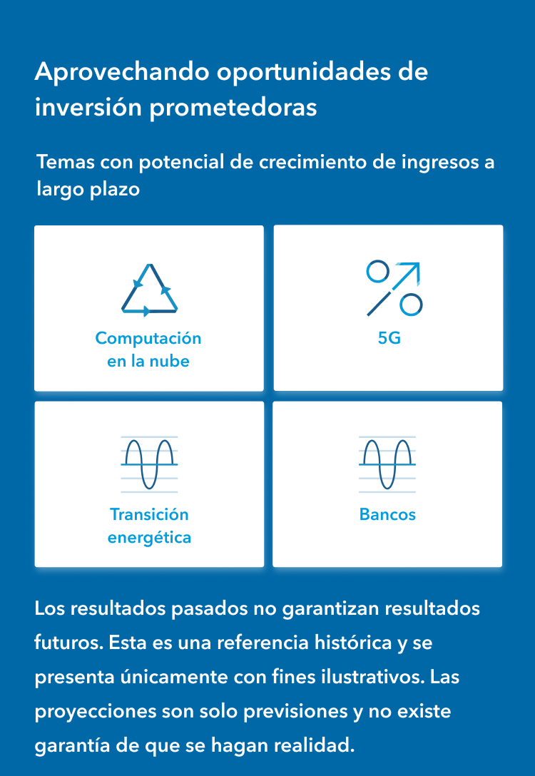
The experience needed to support French, Spanish, German and Italian content without losing the clarity and consistency of the original page structures.
I adapted the digital layouts across these language versions, maintaining a consistent hierarchy, visual identity and navigation approach.
This reduced the need for fund-specific layouts while supporting a more cohesive experience across international markets.
-
I prepared UI layouts and developer handover guidance to help ensure the intended design patterns could be implemented consistently.
The final design approach brought together fund information, documentation links, video content and reusable components within a unified digital structure.
Desktop screens
-
Desktop screens -
Conclusion
This project reinforced the importance of balancing consistency with flexibility.
Designing for financial services requires more than presenting information attractively. It means understanding how content is organised, identifying what users need to access and creating patterns that remain reliable as information changes.
The experience strengthened my approach to information architecture, component-driven design and collaborating across digital and brand communications.
Mobile screens
-
Mobile screens -